CARA A. BROWN, MBA • DESIGN STRATEGIST + SERVICE DESIGNER
CARA A. BROWN, MBA • DESIGN STRATEGIST + SERVICE DESIGNER
A team of four design strategists partnered with an interior design entrepreneur to validate, define, and launch a novel e-commerce concept — grounding an ambitious idea in 50 interviews, a rigorous experience model, and a navigation architecture that made room-first shopping actually work.
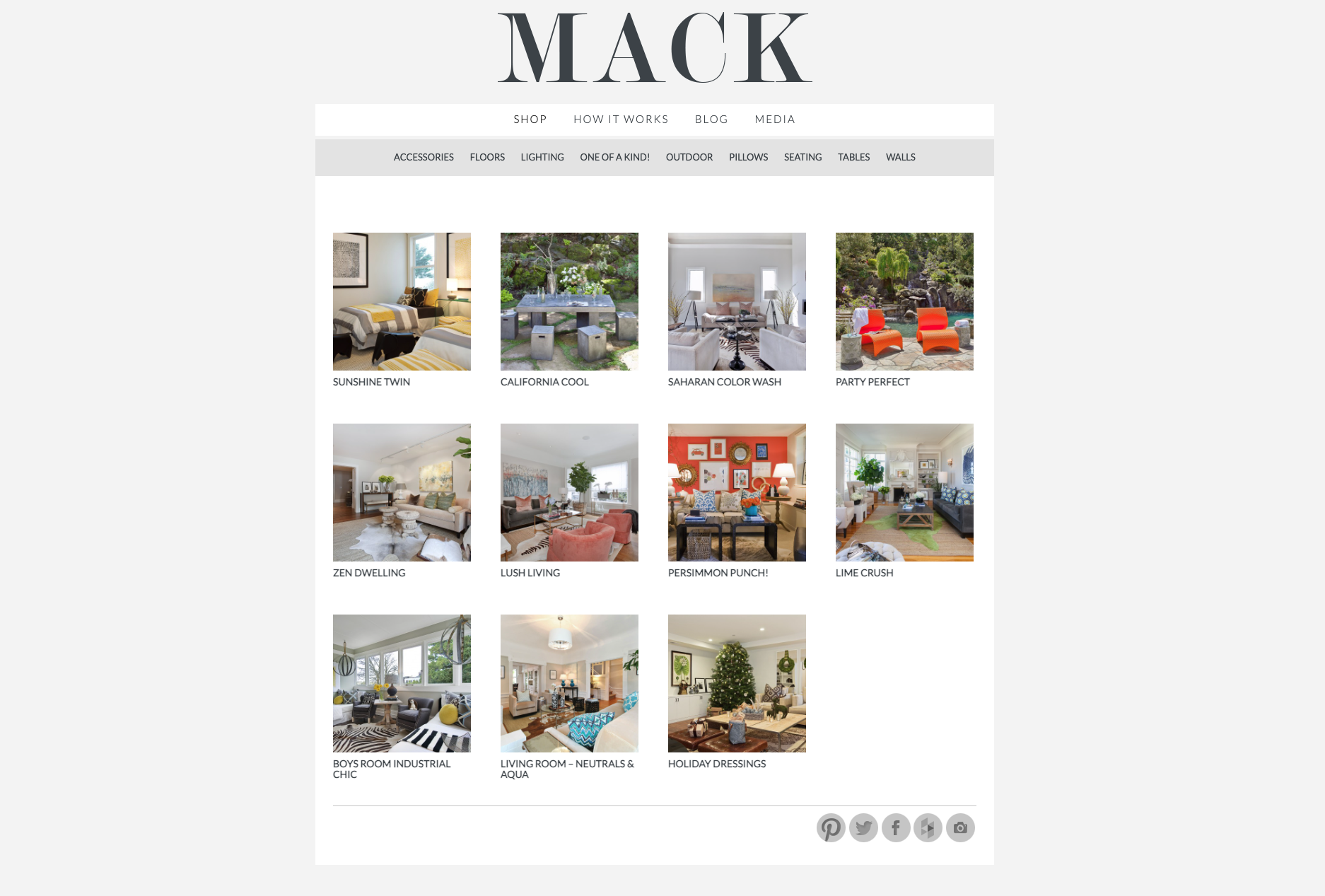
The shopMACK homepage — a room-first browsing model with secondary navigation by category, style, and color. Built from 50 interviews and rigorous synthesis, not founder preference.
Tamara Mack had a genuinely novel concept: shop fully designed rooms, buy the entire room with white-glove delivery and installation, or pick individual pieces from it. The vision was clear. The business model, experience architecture, and navigation logic were not.
The work had three real constraints: an ambitious founder with strong opinions, a tight three-month timeline, and a need to ground every decision in evidence rather than preference. Getting a novel concept to launch requires translating market reality into scope — which is often harder than the design work itself.
Evidence-based decisions are the only kind that reduce launch risk. Fifty interviews later, we knew what the experience model had to do.
We needed to understand what made online home furnishing feel risky — what created hesitation, what built confidence, what caused abandonment. The research wasn't about validating the concept. It was about understanding the decision environment so we could design for it accurately.
Synthesis is the step most design processes skip or rush. We used our findings to define what the business could and couldn't be at launch — which offerings to lead with, which audiences to prioritize, which scope decisions to push back on. Evidence-based tradeoffs rather than founder preference or team intuition.
The core insight: some shoppers start with a room vision, others start with a category, others with a style or a color. The experience model needed to support all four entry points without creating confusion. We defined the hierarchy — rooms first, with clean lateral access to alternative paths — that became the navigation architecture.
Getting a founder from "everything I've envisioned" to "what can actually launch in three months at quality" is a design task. We facilitated the tradeoffs explicitly — not by overriding the founder's vision, but by making the cost of each scope decision visible against the launch timeline and resource reality.
Full case study: Complete process documentation — research, synthesis, decisions, and tradeoffs. Available as PDF.
Read the full case study →
Experience model: Room-first browsing with secondary navigation by category, style, and color — designed for four distinct shopping mindsets.
A lofty, ambiguous concept grounded into an executable business and experience model within a tight timeline — without scope creep or quality compromise.
Every major experience decision — navigation model, value proposition, scope — was traceable to research findings, not preference.
Named an innovative e-commerce site to watch by iMediaConnection, alongside HauteLook, Warby Parker, and AmazonCart — validating that rigorous process produces standout outcomes.
This is what design strategy looks like as a discipline: not visual design, not UX deliverables, but the rigorous process of getting from ambiguous vision to executable model — grounded in evidence, honest about constraints, and focused on what will actually work at launch.
How I Work →